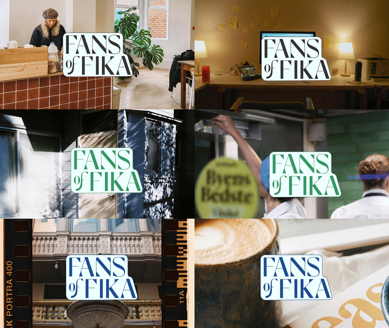
CASE: I designed and developed Fans of Fika, a digital platform for fika enthusiasts, with a cohesive visual identity. The project includes a custom typographic wordmark, bespoke icons, and a distinct imagery style that highlights fika in various contexts—showcasing that fika fits anytime, anywhere.
The wordmark balances rounded and angular shapes to create a modern and playful expression. This contrast is also reflected in the custom-designed icons, which simplify and stylize the most iconic elements of fika. The imagery focuses on the versatility of the fika moment, using dynamic compositions and warm tones to reinforce an inviting atmosphere.
A key focus of the project was also setting the website’s text in Roboto Variable, providing flexibility in weight and width for optimal readability and a contemporary feel. This typographic choice creates a clear and modern foundation that complements the playful identity and enhances the digital experience.
The website is designed to be both inspiring and user-friendly, with a visual identity that reinforces the message that fika is more than just a break—it’s a culture and a way to connect.
Fans of Fika
Spring 2025


